Sucafina

Is it possible to create a coffee marketplace that's as enjoyable as sipping a latte?

Is it possible to create a coffee marketplace that's as enjoyable as sipping a latte?

My role

UX Designer -

UX Designer -

Feature scoping, User research, Competitor analysis, UI/ UX Design

Feature scoping, User research, Competitor analysis, UI/ UX Design

My team

Project manager, UX Lead, UX Designer, UI Designer

Project manager, UX Lead, UX Designer, UI Designer

Duration

3 months

3 months

The context

Let’s picture this

☕🤔

Imagine a roaster searching for the perfect coffee beans, navigating a complex digital marketplace.

😕❌

The roaster is frustrated by unclear information, limited filters, and a lack of transparency about sustainability practices.

🤩🔍

The roaster wants a seamless experience, easy navigation, and in-depth product details.

What if a coffee marketplace could transform the sourcing process, empowering roasters to make informed decisions, discover sustainable options, and support ethical coffee production?

What if a coffee marketplace could transform the sourcing process, empowering roasters to make informed decisions, discover sustainable options, and support ethical coffee production?

That’s where Sucafina steps in!

Sucafina wants their offer listing and product detail pages revolutionize the coffee sourcing experience, delivering an intuitive, user-friendly platform that attracts discerning roasters and elevates the industry towards a more sustainable future.

Sucafina wants their offer listing and product detail pages revolutionize the coffee sourcing experience, delivering an intuitive, user-friendly platform that attracts discerning roasters and elevates the industry towards a more sustainable future.

The challenge

A Maze of Information

Navigating Sucafina's offer listing and product detail pages was akin to wandering through a labyrinth. Users were confronted with a cluttered interface, redundant information, and a lack of visual clarity.

Navigating Sucafina's offer listing and product detail pages was akin to wandering through a labyrinth. Users were confronted with a cluttered interface, redundant information, and a lack of visual clarity.

Fragmented journey: Multiple screens, multiple steps, one big headache.

Fragmented journey: Multiple screens, multiple steps, one big headache.

No visual assets: Coffee without a picture? That's like a story without words.

No visual assets: Coffee without a picture? That's like a story without words.

Multiple re-directions: Navigating Sucafina's website felt like wandering in a digital maze.

Multiple re-directions: Navigating Sucafina's website felt like wandering in a digital maze.

Understanding the product

We organized a discovery workshop with two key stakeholders to delve deeper into Sucafina's offer listing and product detail page.

The primary objectives of this phase were to:

We organized a discovery workshop with two key stakeholders to delve deeper into Sucafina's offer listing and product detail page.

The primary objectives of this phase were to:

Understand the business objectives and develop a shared understanding.

Comprehend both user and business goals to prioritize features effectively.

Gain insights into our primary users by exploring their current journey with the coffee trading platform and our proposed journey.

Understand the business objectives and develop a shared understanding.

Comprehend both user and business goals to prioritize features effectively.

Gain insights into our primary users by exploring their current journey with the coffee trading platform and our proposed journey.

During the discovery call, the stakeholder provided valuable insights into the buyer/roaster journey, demonstrating the steps required to purchase a coffee variety of their choice. Additionally, we received login credentials to explore the website and simplify the purchasing process. Key suggestions from the client during the call included:

During the discovery call, the stakeholder provided valuable insights into the buyer/roaster journey, demonstrating the steps required to purchase a coffee variety of their choice. Additionally, we received login credentials to explore the website and simplify the purchasing process. Key suggestions from the client during the call included:

Understanding the users

The user personas for Sucafina's offer listing and product detail pages are carefully crafted to address the needs of different buyer subsets. Each persona represents a unique segment of the target audience, ensuring the design solutions cater to varied user needs and expertise levels.

The user personas for Sucafina's offer listing and product detail pages are carefully crafted to address the needs of different buyer subsets. Each persona represents a unique segment of the target audience, ensuring the design solutions cater to varied user needs and expertise levels.

Speciality coffee

First-time roaster, buyer

First-time roaster, buyer

Manage order history, evaluate quality notes, and maintain favorite coffees.

Manage order history, evaluate quality notes, and maintain favorite coffees.

First-time roaster, buyer

Experienced roaster, first-time buyer

Manage order history, evaluate quality notes, and maintain favorite coffees.

Evaluate specialty coffee details and connect with traders for negotiation.

First-time roaster, buyer

Experienced roaster, repeat buyer

Manage order history, evaluate quality notes, and maintain favorite coffees.

Manage order history, evaluate quality notes, and maintain favorite coffees.

COMMERCIAL coffee

First-time roaster, buyer

Experienced roaster, first-time buyer

Manage order history, evaluate quality notes, and maintain favorite coffees.

Review compliance, sustainability efforts, and quality programs for bulk purchasing.

First-time roaster, buyer

Experienced roaster, repeat buyer

Manage order history, evaluate quality notes, and maintain favorite coffees.

Ensure compliance and sustainability, manage sourcing certifications.

Value propositions

I then started to put the solutions I brainstormed into a list of product features to create a comprehensive product roadmap. These features were sorted into four categories, including Must-have (P1), Nice-to-Have (P2), Surprising and Delightful (P3), and Can-come-later (P4) features. They were sorted based on how well they can help achieve business goals and user goals.

Product Roadmap not only infuses the project goals into our product but also ensures we prioritize the most important features in the development cycle.

Major problems

from research insights

Major problems

from research insights

“Different regions had distinct preferences for coffee evaluation and price visibility.”

“Unable to adjust order quantities directly on the website for smaller purchases and provide a "Contact Trader" option for larger orders.”

The absence of images and visual elements made it difficult for users to visualize coffee products.

Duplicate listings appeared across multiple pages, confusing users.”

Samples of the UX audit

During the discovery call, the stakeholder provided valuable insights into the buyer/roaster journey, demonstrating the steps required to purchase a coffee variety of their choice. Additionally, we received login credentials to explore the website and simplify the purchasing process. I have identified and documented the real-time screenshots that would benefit from enhancements in terms of overall flow.

During the discovery call, the stakeholder provided valuable insights into the buyer/roaster journey, demonstrating the steps required to purchase a coffee variety of their choice. Additionally, we received login credentials to explore the website and simplify the purchasing process. I have identified and documented the real-time screenshots that would benefit from enhancements in terms of overall flow.

#1

i. Offer list appears on:-

Offerings landing page (basic info),

Coffee variety detail page,

On click of “Read More” redirects to origin page where the offerlist is again showcased.

This redundancy confuses users who might think there are multiple offers.

ii. Essential details aren't readily available and require clicking on the plus icon to view the sensory and other details.

Old screen of coffee profile detail page

#2

i. The "Log in" button appearing on every item seems unnecessary and repetitive. It might be better to have it only in a prominent location where users can easily access it when needed.

i. The "Log in" button appearing on every item seems unnecessary and repetitive. It might be better to have it only in a prominent location where users can easily access it when needed.

ii. Allowing users to change currency before logging in isn't intuitive. Since there are no prices displayed at that stage, the currency selection seems irrelevant. It might be better to enable currency selection after login, perhaps during checkout.

ii. Allowing users to change currency before logging in isn't intuitive. Since there are no prices displayed at that stage, the currency selection seems irrelevant. It might be better to enable currency selection after login, perhaps during checkout.

Old screen of coffee profile detail page

#3

i. Missing origin filter [origin page]- The offer list on the origin information page, does not have an option to filter by “origin”.

i. Missing origin filter [origin page]- The offer list on the origin information page, does not have an option to filter by “origin”.

ii. Currently applied filters aren't readily visible in the offer list, making it difficult to quickly identify and remove them if needed.

ii. Currently applied filters aren't readily visible in the offer list, making it difficult to quickly identify and remove them if needed.

Old screen of offer listing page

Upon a thorough examination of these challenges, including the assessment of user drop-off rates and the increasing complexity of Sucafina's product offerings, it became evident that a comprehensive redesign and reconstruction of the digital platform were crucial.

Streamlining the purchase process, improving information accessibility, and aligning regional preferences can lead to higher user satisfaction and engagement. Ultimately, these improvements will support Sucafina's business objectives by facilitating smoother transactions, increasing conversion rates, and strengthening customer loyalty.

Redesign goals

Based on the insights gathered from the discovery phase and user feedback, the following redesign goals were established to improve Sucafina's digital platform:

Based on the insights gathered from the discovery phase and user feedback, the following redesign goals were established to improve Sucafina's digital platform:

Information architecture

Based on the current website's structure, a proposed information architecture was developed to address the identified user experience issues. The primary goal was to reduce the number of possible redirections to the offer listing page, thereby minimizing user confusion and streamlining navigation.

Based on the current website's structure, a proposed information architecture was developed to address the identified user experience issues. The primary goal was to reduce the number of possible redirections to the offer listing page, thereby minimizing user confusion and streamlining navigation.

Final shipped designs

RESULT

#1 Pre-login screen

01

A centralised login button is now placed consistently.

A centralised login button is now placed consistently.

02

Categories such as "Commercial," "Specialty," and "All" are organized into tab switches.

Categories such as "Commercial," "Specialty," and "All" are organized into tab switches.

03

A sort option is included to help users quickly find popular products.

A sort option is included to help users quickly find popular products.

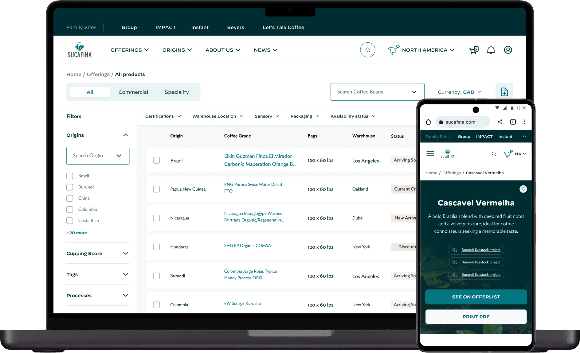
Old product- Offer list

Revised version

RESULT

01

Incorporated features like the "favorite icon," sorting options, and expand/collapse functionality.

Incorporated features like the "favorite icon," sorting options, and expand/collapse functionality.

02

Added search bar, vertical/horizontal filters, and prioritization of filters for efficient browsing.

Added search bar, vertical/horizontal filters, and prioritization of filters for efficient browsing.

03

Added info icons for status clarification and displayed prices for different quantities with discounts.

Added info icons for status clarification and displayed prices for different quantities with discounts.

Offerlisting iterations

To meet user expectations, I experimented with various offer listing iterations, visually and functionally differentiating items to create a more engaging and intuitive experience. These variations helped us refine the design and identify the most effective approach.

To meet user expectations, I experimented with various offer listing iterations, visually and functionally differentiating items to create a more engaging and intuitive experience. These variations helped us refine the design and identify the most effective approach.

RESULT

#2 Product design card

01

Each card clearly displays origin and a brief overview.

Each card clearly displays origin and a brief overview.

02

Each card clearly displays origin and a brief overview.

Each card clearly displays origin and a brief overview.

03

Iterative design process addressed the absence of images, resulting in effective card layouts.

Iterative design process addressed the absence of images, resulting in effective card layouts.

Old product- Get quote

Revised version

RESULT

01

Grouped necessary input fields for a streamlined experience.

Grouped necessary input fields for a streamlined experience.

02

Included a checkbox to allow users to request samples alongside quotes.

Included a checkbox to allow users to request samples alongside quotes.

03

Displayed estimated price, discount, and total cost upfront for clarity.

Displayed estimated price, discount, and total cost upfront for clarity.

RESULT

#4 Coffee beans comparison

01

Enabled users to compare coffee beans based on key attributes (origin, cupping score, certifications).

Enabled users to compare coffee beans based on key attributes (origin, cupping score, certifications).

02

Facilitated informed decision-making by providing a comprehensive overview of multiple options.

Facilitated informed decision-making by providing a comprehensive overview of multiple options.

Old product- detail page

Revised version

RESULT

01

Placed essential details in the first fold for easy access.

02

Added a "See on Offer List" CTA for easy navigation.

03

Reduced empty space for coffee products from the same profile.

Reflection

Visual and Content Iterations: Through multiple iterations and variations of different layouts, both visually and content-wise, I learned the importance of testing various designs to find the most effective solution. This iterative process was crucial for balancing visual hierarchy and usability.

Managing Change and Achieving Alignment: Adapting to constant changes was a key challenge. By prioritizing tasks, articulating clear goals, and fostering open communication, I ensured the team remained aligned and focused on delivering a successful solution.

Continuous improvement: Regularly gathering user feedback and monitoring platform performance is vital for ongoing improvement. By staying attuned to user needs and industry trends, I ensured that Sucafina's marketplace remained relevant and effective.

Connect to Content

Add layers or components to infinitely loop on your page.

You've reached the end, how about next story?

Create a free website with Framer, the website builder loved by startups, designers and agencies.